
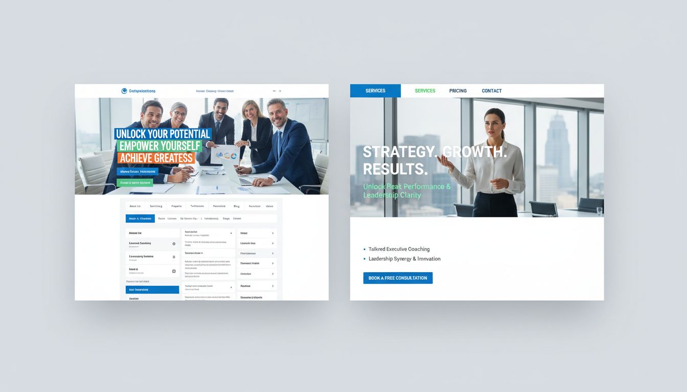
You can spot an average coaching site a mile away. Same stock photo. Same vague promise about “unlocking your potential”. Same confusing navigation that makes you click three times just to find pricing.
If you are searching for executive coaching website examples, you are probably already over it. You want something sharper. You want real examples that actually book clients and feel aligned with how you lead.
Because here is the thing. Your site is not a brochure. It is often the first leadership test people see from you.
Potential clients judge your credibility fast. Research on website credibility shows that about three-quarters of those snap judgments come from design and overall look, not the copy. If that stings a bit, good.
It means you care enough to fix it. This is about more than just aesthetics. It is about signalling competence immediately.
If you do not have a proper site yet, it matters even more. A study on small business websites showed that 84% of consumers think a business with a site is more credible. Executive buyers are at least that picky, usually more.
Your target audience expects digital professionalism. So let us walk through what works and where people go wrong. We will look at executive coaching website examples to give you concrete ideas to swipe for Innovacious and your own brand.
Table Of Contents:
- What Makes an Executive Coaching Site Actually Work
- 6 Executive Coaching Website Examples That Actually Inspire Growth
- More Sites to Study for Leadership and Coaching
- How to Turn These Executive Coaching Website Examples Into a Plan
- Common Mistakes Executive Coaches Make With Their Websites
- Conclusion
What Makes an Executive Coaching Site Actually Work
You are not building a pretty art project. You are building a silent salesperson that talks to busy founders, CEOs, and senior leaders while you sleep. This digital asset needs to perform.
Visitors have three questions in their heads when they hit your home page.
First, is this person legit enough to handle my level of responsibility? They need to know you operate at their altitude.
Second, do they get my exact problem or are they generalists? A professional coach specialising in executives is very different from a generalist.
Third, how hard will it be to start working together?
Most executive coaches answer none of that above the fold. They hide behind poetic copy and a mysterious “Work with me” page. This confuses the visitor.
If you look at any well-built coaching website that converts, three patterns keep showing up.
- Clear, direct headline that says who you help and what changes for them
- Clean layout that works on mobile and does not fight for attention
- Simple path to take the next step, usually a short form or calendar
Think of your site as an executive coaching conversation, but in web form. You are not giving your full leadership model in one hit. You are showing that you see the problem and have a method.
There must be a low-friction way to talk. If you make them work too hard, they will leave. You want to be one of the best coaching websites in their browser history, not the most confusing.
6 Executive Coaching Website Examples That Actually Inspire Growth
Enough theory. You are here to see executive coaching website examples that already pull their weight. Some of these are broad personal brands, but the principles map directly to executive work.
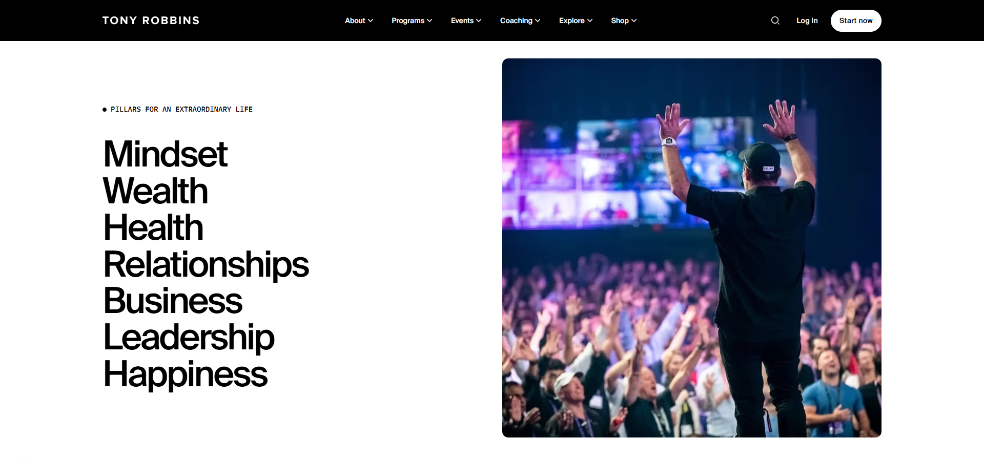
1. Tony Robbins – High Energy Authority At Scale
Everyone knows Tony Robbins, but look past the fame for a second and study the structure. His website is a machine.
The hero section hits with one big promise and a focused call to action. It pushes you either to a clear offer or an event. No guessing. No clutter.
This matters because executives rarely dig through three levels of navigation. You have one shot to show where you want them. Tony’s team also leans hard on social proof.
There are multimedia elements, testimonials, logos, and outcomes layered down the page. The layout answers the silent question “Why should I listen to you?” over and over in different ways.
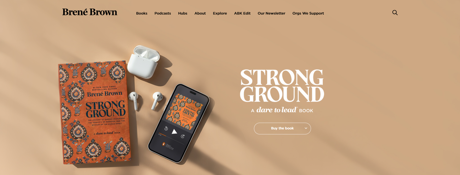
2. Brené Brown – Deep Trust With Clean Simplicity
Now jump across to Brené Brown. Very different energy. Slower. Warmer. Still sharp.
Brené leads with clarity around her work on courage, vulnerability, and leadership. Her navigation groups work in a simple way. There are clear pathways for people interested in speaking, research, or her content.
The emotional tone on her site is a great example for executive coaches who lean more into depth than hype. She still gives enough structure for a CFO or COO to understand the value. They can see how this translates into performance and culture.
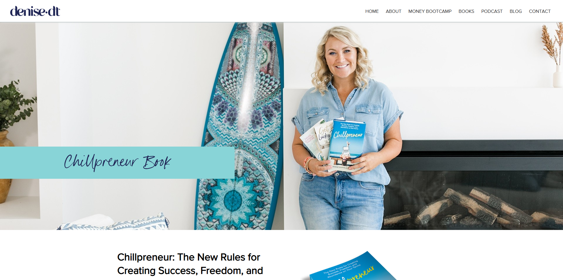
3. Chillpreneur – Calm Money Confidence
Take a look at Chillpreneur. It is more lifestyle-focused, yet there are useful patterns for founder coaching sites. It is a great coaching website example for simplicity.
The site is built around one core concept and that idea carries through every section.
Copy, images, and colour choices all point to ease, profit, and a more grounded way to work. There is no random “services buffet”.
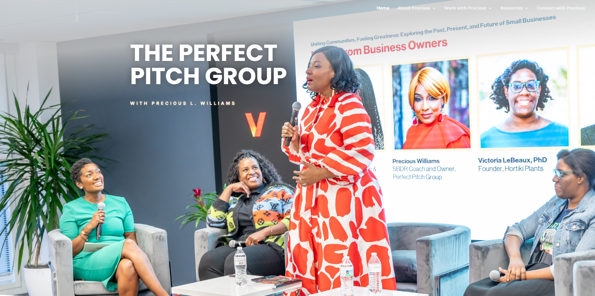
4. Perfect Pitch Group – Clear B2B Positioning
Perfect Pitch Group is an interesting example because it straddles coaching and consulting for commercial storytelling. They know their target audience perfectly.
They speak directly to revenue leaders and teams, not the general public. You see references to sales cycles, conversions, and commercial outcomes all through the copy.
If you are coaching executives, lean this way. Ground your copy in language your buyer uses every day. Talk about board meetings, stakeholder pressure, change fatigue, risk, and growth.
This shows that you understand their world far better than generic self-help phrasing. It builds instant rapport.
5. Luisa Zhou – Sharp Offer For Entrepreneurs
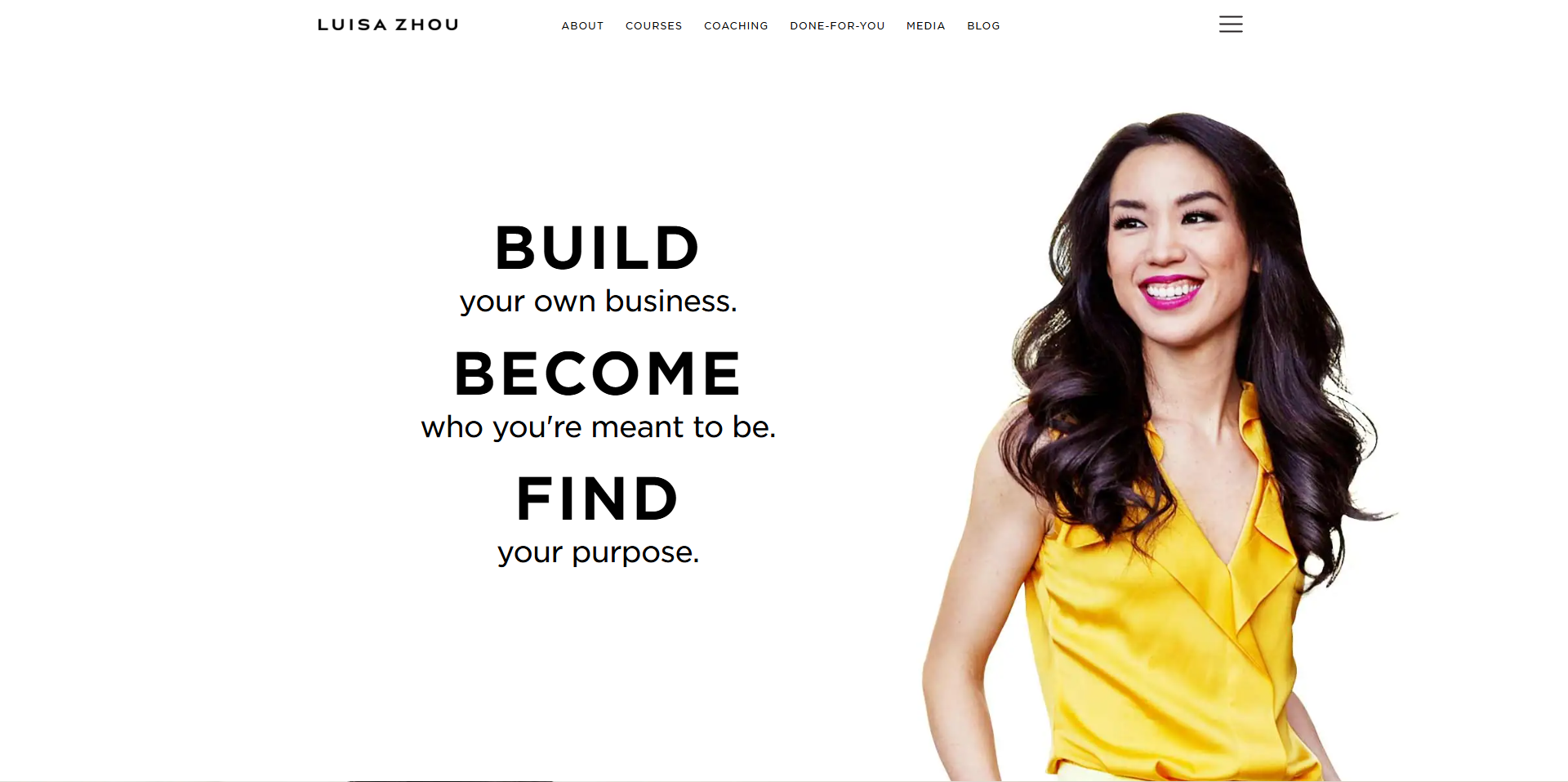
Luisa Zhou has built her brand around helping people start and grow online businesses. Different audience to C-suite leaders, but you can still learn from the way she sets up her offer ladder.
There is a very clear flagship program. Then there is content, lead magnets, and proof all flowing toward it. Nothing feels random. It feels like a path.
6. Ralph – Academic Depth Meets Strategy
Someone like Ralph shows how depth of thinking can sit beside client-focused work without feeling too academic. That mix builds trust for senior people who live and breathe strategy. It proves you have substance.
His site avoids the fluff often found in the industry. It speaks to intellect and results simultaneously. This balance is key for high-level executive engagement.
More Sites to Study for Leadership and Coaching
You can widen your research further with other high-performing personal brand sites.
- Gabrielle Bernstein for how to handle a lot of offers without chaos.
- Susie Moore for confident, simple copy that still sells hard.
- Cultivitae for career-focused coaching that speaks to professionals.
- Employee Redefined for corporate positioning and B2B feel.
- Lowina Blackman for an Australian market take on personal brand.
- Susan Francis for mindset-heavy coaching that still links to money.
- Dr Shannon Irvine for weaving neuroscience into coaching offers.
- Marie Forleo for clean navigation, sharp content hubs and strong brand feel.
These are not strictly executive coaching website examples, but each one does one thing extremely well: structure, offer, visual identity, and copy.
Take notes on those parts and map them back to the leaders you serve. Steal the strategy, not the style.
How to Turn These Executive Coaching Website Examples Into a Plan
You might be thinking, this all sounds great, but how do I translate it to my site? You do not want to vanish into a rabbit hole for six months.
Use a very simple three-step loop: Audit. Decide. Implement.
This keeps momentum high.
Step 1: Audit Your Current Site Like an Executive Would
Open your own site on a phone. Give yourself 15 seconds. Then be brutally honest about what sticks.
- Can you tell in one glance who you work with and what changes for them?
- Is there one clear next step above the fold, or three competing buttons?
- Does the page feel calm and focused, or noisy and scattered?
Ask a current or past client to do the same. Sit next to them or watch on a quick call. Do not explain anything to them.
Just notice where they hesitate. Watch what they click and listen to what they say out loud. Their confusion is your roadmap.
Step 2: Decide Your Core Promise and Proof
Executives hire you for outcomes, so name them plainly. You might focus on faster strategic decisions or stronger senior teams.
Maybe your focus is succession readiness or scaling from founder-led to systems-led. Whatever your edge is, give it a short name you can repeat all across the site. Clarity beats cleverness here.
Then match that with real proof. You can bring in testimonials, short case stories, and even thought pieces you have published elsewhere.
Step 3: Implement Small But Focused Changes
You do not need to burn the site to the ground. Start with what drives most behaviour.
- Rewrite your home page hero line and subheading to match your real outcomes
- Strip the navigation to the essentials: about, services, resources, contact
- Add one clear button, either “Book a consultation” or “Talk about coaching”
From there, tighten your images using the principles from any solid coaching website feature list. Use real photos where you can. Stock images of two strangers shaking hands at a boardroom table signal the exact opposite of trust.
A business coach using generic photos looks generic. Use photos of you working, speaking, or thinking. Authentic imagery builds a connection faster.
Common Mistakes Executive Coaches Make With Their Websites
After watching a lot of sites for coaches, some patterns get boringly common. Avoiding these puts you ahead of the pack.
- Writing to “everyone who wants growth” instead of a clear segment like founders or C-suites.
- Burying pricing so deep that it feels secret and slippery.
- Using heavy jargon instead of grounded leadership language.
- Forgetting to show an actual face, voice, or story on the site.
- Ignoring mobile, even though many execs check things between meetings on phones.
- Confusing life coaching aesthetics with corporate expectations.
Your site does not need to be perfect. It does need to feel honest and confident. Executives can sense fear and overcompensation quickly.
Conclusion
If you have read this far, you probably care a lot more about how you show up online than most coaches do. That already gives you an edge over many executive coaching website examples you see on Google today.
Remember, a strong executive coaching site is not about copying Tony Robbins or Brené Brown. It is about taking the best patterns from these examples and adapting them. Learn from research-backed design and wider coaching website guides.
Take solid executive coaching thinking, then reshape it so it fits your voice and your clients. You want someone to land on your site and feel seen as a leader. They should know within thirty seconds that you are the person they want in their corner.
If your current site does not do that yet, that is not a failure. It is simply your next growth project for Innovacious and your own coaching practice. Change a headline.
Sharpen an offer. Swap one awkward stock photo for something that looks like your real workday. Small changes stack up fast when the right people are already searching for you.