
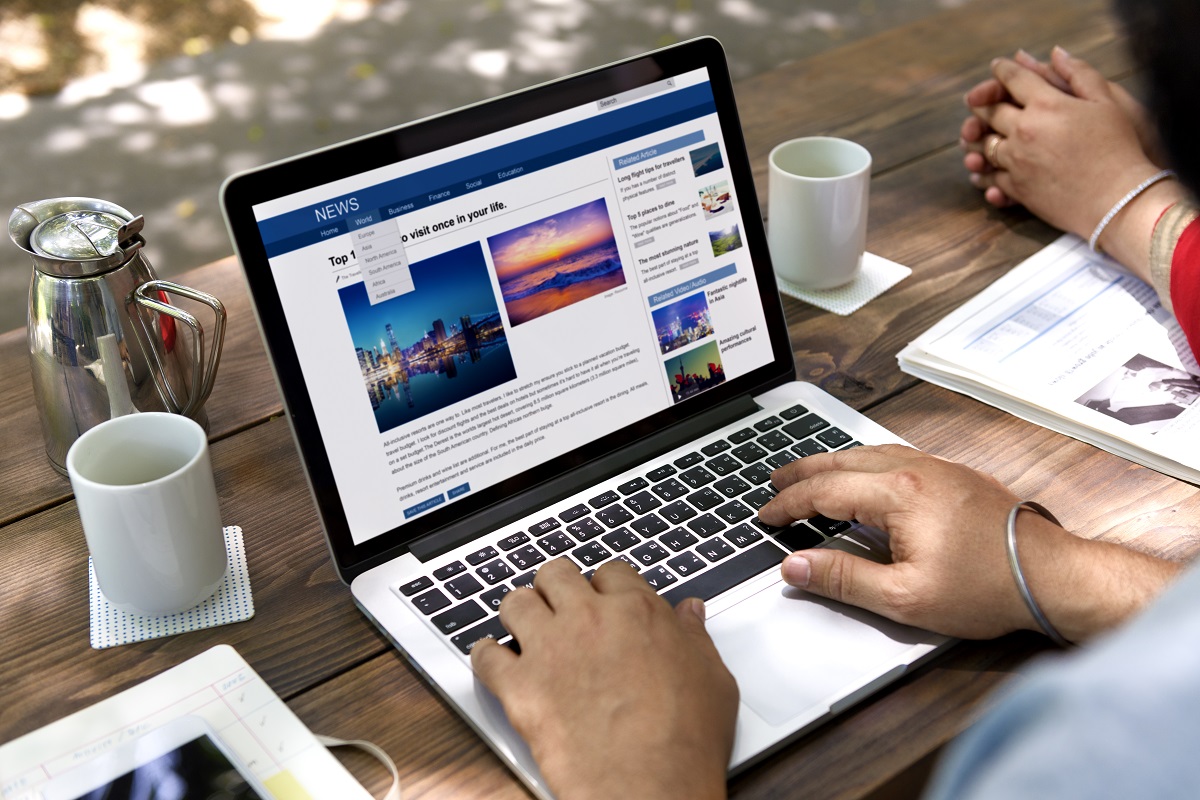
Someone lands on your website. They haven’t read anything or clicked yet, but a decision is already forming.
Within seconds, they judge if your business feels trustworthy, competent, and worth their time. If that first impression is unclear or unprofessional, they leave before they ever see your offer.
Your website speaks before your content does.
And what it says determines whether a visitor becomes a lead or disappears.
The 3-Second Website Judgment
People like to believe they evaluate websites rationally.
- They read the content.
- They compare options.
- They carefully decide.
In reality, the process is faster and far more instinctive.
Research on web usability consistently shows that users form a first impression of a website in fractions of a second. Some studies place this judgment at around 50 milliseconds. In practical terms, that means your visitor decides how credible your business feels almost immediately.
During that moment, people are not analyzing your service. They are sensing signals:
- Your layout
- Your visual clarity
- Your typography
- Your spacing
- Your imagery
All of it creates an emotional reaction before logic ever enters the conversation. The brain uses shortcuts to answer one question fast: “Does this look professional?” If the answer is no, most visitors leave before they ever learn anything else.
Your Website Is Not Being Evaluated. You Are.
Most businesses think visitors are judging the website, but they’re really judging the company behind it. The site becomes a stand-in for how you operate, so every visual detail, layout choice, and interaction signals what working with you will feel like.
Visitors subconsciously ask questions like:
- Are these people professional?
- Do they know what they’re doing?
- Can I trust them with my money or time?
- Are they modern and competent?
And they answer those questions instantly.
Consider a simple example.
Two consultants offer identical services. Both are experienced. Both have strong results.But one website looks modern, clear, and structured.The other looks cluttered, outdated, and confusing.
The visitor never compares the services. The decision happens in seconds. Professional design signals competence. Disorganized design signals risk. That interpretation may not be fair. But it is how people behave online.

7 Things Visitors Instantly Assume About Your Business
When someone lands on your website, they begin forming assumptions immediately. These assumptions shape whether they continue exploring or leave.
Here are the most common judgments people make in the first few seconds.
1. Professionalism
Clean layouts signal professionalism. Messy layouts suggest carelessness. Visitors notice:
- alignment
- spacing
- typography
- visual hierarchy
If a site feels chaotic, people assume the business may operate the same way.
2. Trustworthiness
Trust forms quickly online. Elements that influence trust include:
- modern design
- clear branding
- professional imagery
- recognizable structure
If a website looks outdated or amateurish, visitors often question the legitimacy of the business itself. Even strong companies lose credibility through weak presentations.
3. Authority
Authority is communicated visually before content is even read. Design elements that signal authority include:
- strong headlines
- structured sections
- clear messaging
- confident visual presentation
When a website looks polished and focused, it feels like the work of experts. When it looks improvised, visitors assume the opposite.
4. Competence
People assume competent businesses have organized websites. They expect clarity and structure from the moment they land.
If visitors struggle to understand what the company does within seconds, that confusion quickly turns into doubt about the company’s expertise. Clear communication signals competence, while confusion signals uncertainty.
5. Organization
A website reflects how organized a business feels. Visitors notice whether information is easy to scan. They look for clear sections and logical flow. If the homepage overwhelms them with clutter, they assume the business lacks structure. When a page feels clean and ordered, the company feels reliable.
6. Modernity
Technology evolves quickly. Websites that look outdated send a message. They suggest the business might also be outdated. Design trends change over time. Modern websites tend to feel:
- lighter
- more spacious
- easier to read
- more visually structured
When a site looks stuck in the past, visitors question whether the business is keeping up with the present.
7. Reliability
Reliability is communicated through details. Fast loading speed. Smooth navigation. Responsive design. If a site loads slowly, breaks on mobile, or behaves unpredictably, visitors interpret that as a warning. A reliable website suggests a reliable business. A frustrating experience suggests the opposite

The Hidden Cost of a Bad Website First Impression
Many businesses underestimate how expensive a weak website can be. The damage often happens quietly. Visitors leave without saying anything.
- No complaint
- No feedback
- Just a silent exit
The result is a lost opportunity.
Here are some common consequences:
Lost Leads
Potential customers visit your site and leave within seconds. They may have been ready to buy. But something about the experience felt uncertain. They move on to the next option.
Lower Conversion Rates
Even when visitors stay longer, weak first impressions reduce confidence. People hesitate. They second-guess whether they should trust the company. Conversions drop.
Higher Bounce Rates
Search traffic might reach your website. But if the page fails to create instant clarity, visitors return to the search results quickly. Search engines notice that behavior. Over time, it can reduce visibility.
Missed Authority Opportunities
Your website should position you as the obvious expert. If the design does not support that perception, your expertise becomes harder to communicate. Visitors simply assume competitors are more capable.
The 3-Second Website Test
A simple exercise can reveal whether your website communicates the right message. Open your homepage. Look at it for three seconds. Then answer these questions:
1. Is it immediately clear what the business does?
Visitors should understand the core service almost instantly. If your headline is vague or abstract, confusion appears immediately. Clarity beats cleverness every time.
2. Does the page feel organized?
Check for visual structure. Are sections clearly separated? Is the layout easy to scan? If the page feels overwhelming, visitors disengage quickly.
3. Does the site look modern?
Design does not need to be trendy. But it should feel current. Outdated visuals often undermine credibility before the content can help.
4. Does the page signal authority?
Visitors should sense expertise immediately.
Authority signals include:
- confident messaging
- structured information
- professional visuals
- clear positioning
If the page feels generic, authority is lost.
5. Does the site feel trustworthy?
Trust signals can include:
- testimonials
- recognizable brands
- professional design
- clear contact information
If these elements are missing, visitors hesitate.
How to Fix a Weak First Impression
Improving first impressions does not always require a full redesign. Often, the biggest improvements come from clarity and structure. Here are several high-impact changes:
Clarify the Headline
Your homepage headline should answer one simple question: What do you do? Avoid vague phrases. Strong headlines communicate value immediately. Example: Instead of “Helping Businesses Grow” try “Automation Systems That Save Small Businesses 10+ Hours Every Week” Clarity creates confidence.
Improve Visual Hierarchy
Visitors should know where to look first.
Good hierarchy uses:
- large headlines
- clear sections
- spacing between elements
- consistent typography
Structure guides attention.
Simplify the Layout
Too many elements compete for attention. Reduce clutter. Focus on the most important information first. Clear pages feel more professional.
Add Authority Signals
Authority builds trust quickly.
Consider including:
- client logos
- testimonials
- case studies
- media mentions
These signals reassure visitors that others trust you.
Optimize Page Speed
Speed influences perception immediately. A slow website feels unreliable. Fast sites feel efficient and professional. Even small improvements can change how visitors perceive the brand.
Why High-Performing Websites Feel Instantly Clear
The best websites share a common trait. Clarity.
Within seconds, visitors understand three things:
- What the business does
- Who it helps
- Why it matters
Nothing feels confusing. The layout supports the message instead of competing with it. Great websites do not overwhelm visitors with information. They guide attention. They reduce friction. They make decisions easier. When that happens, trust forms quickly.
Clarity creates confidence.
Your Website Is Always Communicating
Even when you say nothing, your website is sending a message. Through its design, structure, and clarity, it tells visitors what kind of business you run.
- Professional or careless
- Organized or chaotic
- Expert or uncertain
That message forms instantly. Before anyone scrolls. Before anyone reads.
Your website is your digital first impression. And like every first impression, it can open the door to opportunity or quietly close it. Your website might be sending the wrong signal before visitors even read a single word.
What are you saying right now?
Most business owners don’t see the gaps because they’re too close to their own website. What feels “fine” internally may be costing trust, leads, and opportunities externally.
Instead of guessing, get a clear, objective breakdown. Request a web site audit here. You’ll see exactly how your site performs in those critical first seconds—what it communicates well, where it creates doubt, and what needs to change to turn more visitors into leads.