
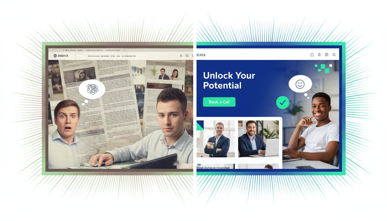
You already know this: if you are a business coach without a sharp website, you are leaking leads every week.
You send people a link, they land on a clunky page, and the energy just drops.
So this guide walks through business coach website design that feels on-brand, converts, and does not make your prospects work so hard just to find your “Book a Call” button.
We will look at how branding, layout, content, and tech work together to build a strong online presence.
By the end, you will know what to change on your own site, step by step.
Table Of Contents:
- The Foundations of Strong Business Coach Website Design
- Branding That Actually Feels Like You
- Key Pages Every Business Coach Site Needs
- Designing a Homepage That Converts for Business Coaches
- Copy and Content That Sound Like a Real Human
- Technical Design That Supports Your Marketing
- Planning Your Own Business Coach Website Redesign
- Conclusion
The Foundations of Strong Business Coach Website Design
Great coaching sites all share a few things.
The words might be different, the photos might be softer or bolder, but the core structure is surprisingly similar.
Here is what sits under the hood of a website designed to convert.
1. A clear promise above the fold
The top section of your homepage needs to answer three simple questions fast.
Who are you, who do you help, and what outcome do you guide them to.
If people have to scroll to find that, you are already losing them.
Take a look at Chillpreneur.
The brand is all about relaxed growth and online business without the grind.
That feeling comes through in the headline, soft colour palette, and calm imagery, long before you start reading the fine print.
Then contrast that with Tony Robbins.
The energy is loud, strong, and driven by events and transformations.
The first screen hits you with social proof, clear programs, and a sense that you are joining a movement.
Your promise must be instantly clear to the visitor.
If you are a weight loss coach, do not hide behind vague corporate jargon.
State exactly how you help people lose weight and regain confidence.
2. One main call to action per page
Your visitor should never need to guess what to do next.
For most business coaches, the main action is usually “Book a discovery call” or “Apply for coaching.”
Use that same call to action across your hero section, your mid-page section, and again in your footer.
A good business coach website design keeps the layout simple and trims distractions.
If every button does something different, your reader stalls.
A short, focused path will beat a long menu every time.
You need strong CTAs that stand out visually.
Clear CTAs guide the user journey without confusion.
Avoid generic text like “Submit” and go for “Start Your Transformation.”
3. Mobile first layout and testing
Many of your potential clients will find you while scrolling on their phone between meetings.
So if your layout breaks on mobile, they rarely bother to pinch, zoom, and fight with it.
Modern website design standards are ruthless about mobile speed and clarity.
Here is a simple rule: design for mobile first, then expand for desktop rather than the other way round.
Test your buttons, forms, and text blocks on a real phone, not just on your laptop.
A mobile-friendly life coaching website is essential for capturing traffic from social media.
Channels like Pinterest, YouTube, and Instagram drive mobile traffic heavily.
Make sure your site is ready for those visitors.

Branding That Actually Feels Like You
Your brand is not just a logo that your designer sent through in a zip file.
It is the feeling a client has three seconds after your page loads.
That feeling needs to match the way you coach; otherwise, sales calls feel off from the start.
Study coaches who have nailed their brand
Look at how Brené Brown uses strong typography, white space, and warm photography.
The message is all about courage, humanity, and grounded research.
The visuals quietly back that up instead of stealing the spotlight.
Then look at Luisa Zhou, who helps people build coaching and service-based businesses.
Her site leans into practical content, straight-talking headlines, and clear step-based offers.
The brand says, “You can do this, and here is exactly how.”
Perfect Pitch Group is another great study in sharp positioning.
The brand centres on persuasive communication for leaders and founders.
The messaging is tight, professional, and specific about who they help.
Translate your coaching style into design
Ask yourself how clients would describe you after a great session.
Are you calm and steady, or bold and direct, or quietly analytical?
Write down three words and use them as your design filter.
If you are warm and calm, lean into softer colours, open spacing, and more candid photography.
This approach often works well for a spiritual coach or wellness coach.
If you are high energy, bring in stronger contrast and confident imagery like you see with Tony Robbins.
The point is not to copy them, but to find your lane and stick to it across your pages.
Your coaching style should dictate your set design on the web.
This consistency builds trust with your dream clients.
Key Pages Every Business Coach Site Needs
You do not need 15 pages to book clients online.
Most solo or small practice coaches do best with a tight structure, then build depth inside those pages.
Think more clarity, less clutter.
Below is a breakdown of the essential pages and their functions.
| Page | Main Job |
|---|---|
| Homepage | Hook visitors, give a clear promise, send them to one main next step |
| About | Share your story, credibility, and why your approach works |
| Services or Work With Me | Explain offers, pricing range, and what coaching looks like in practice |
| Case Studies or Results | Show specific before and after stories with proof |
| Contact or Book | Simple way to book a call or send an enquiry |
Designing a Homepage That Converts for Business Coaches
Your homepage is less of a brochure and more like a helpful host.
Its job is to welcome, filter, and guide people to their next best step.
Here is a simple layout you can follow even if you are not a designer.
Section 1: Hero and clear next step
Include a headline with the outcome you help clients achieve.
Add one or two short lines to call out who you work with most.
Then repeat that one main call to action button right below.
This section grabs attention immediately.
Whether you are a productivity coach or a loss coach, the rule is the same.
Do not make them guess what you do.
Section 2: Who you help and common problems
Call out your niche here.
That could be early-stage founders, consultants hitting a revenue ceiling, or service providers burnt out from custom work.
List three core problems you see over and over, in their words, not yours.
For an executive coaching website, mention leadership isolation or strategic overwhelm.
For a fitness coach, talk about the struggle of consistency.
Using their language proves you understand their world.
Section 3: How your coaching works
People are nervous about buying something they cannot touch.
Use this section to make coaching concrete.
Outline what happens in the first 90 days, how often you meet, and what you work on together.
Describe your coaching sessions in detail.
Do you offer group coaching or 1:1 support?
Clarity here removes the fear of the unknown.
Section 4: Social proof and real outcomes
Pull in logos of companies you have worked with, if that applies.
Add short testimonials, or better yet, tiny case snippets with numbers where you can.
For example, “Reduced weekly hours from 70 to 40 while lifting profit” tells a better story than “James was great to work with.”
Section 5: Final call to action
Finish with a short summary of who you help and the promise.
Then invite them again to book that first call, without fluff.
This section often picks up the skimmers who just scroll through first.

Copy and Content That Sound Like a Real Human
You can have the best layout on earth, but if your words sound flat or generic, you lose people.
The best business coach website design wraps clean copy inside a layout that is easy to read.
Here is how to write so that people feel like you are already in conversation with them.
Use client language, not coach jargon
Instead of “support you to level up your potential,” try “help you hit consistent revenue without working weekends.”
Pull phrases from past clients, emails, and call notes.
The closer you are to how they already talk, the more your site will land.
Show what coaching looks like day to day
The International Coaching Federation has clear pages on coaching ethics and professional standards.
You can draw on those themes while still sounding like yourself.
For example, share that your sessions are confidential, that you set goals together, and that you expect clients to take action between calls.
Borrow trust from partners and tools
If you support your coaching with content, templates, or video, mention the tools you use.
For example, if you record custom Loom videos or edit teaching clips, tools from lists like these video editing tools for business coaches can raise your game.
This shows prospects you are not just talking on Zoom and hoping for the best.
Highlight the business tools you use to facilitate growth.
This demonstrates competence and preparedness.
It assures clients that you have a structured approach.
Technical Design That Supports Your Marketing
Your site is part of a bigger system that brings people in and follows up after they leave.
That is where smart technical design helps a lot, even for a solo coach.
You do not need to do all the work yourself, but you should know what to ask for.
Site structure and traffic
Search engines still pay attention to a clean layout, fast load times, and sensible links between pages.
Specialist agencies that care about performance, like this website design company, focus heavily on speed, responsive design, and clear site maps.
These things matter because every second of delay on mobile pushes bounce rates higher.
On top of structure, quality content supports your organic traffic over time.
That means helpful guides, resources, and articles instead of fluffy filler.
Calls to action for different levels of readiness
Not everyone who hits your site is ready to jump on a call.
Give them smaller steps like downloading a short guide, joining a simple email series, or watching a quick video training.
That way, they stay in your orbit while they get a feel for your style.
Offer a free resource in exchange for their email.
This helps you build an email marketing list of interested prospects.
Resources free of charge are a great way to demonstrate value upfront.
Planning Your Own Business Coach Website Redesign
At this point, you might be thinking, “My site needs work everywhere. Where do I even start?”
You are not alone.
So here is a simple way to make changes without tearing everything down at once.
Step 1: Map what you already have
Open your current site in one tab and a blank doc in another.
List all your existing pages and note what is working and what feels off.
Be honest about where you feel slightly embarrassed to send people.
Step 2: Decide your main goal for the site
If your core goal is to get more discovery calls, your design choices get a lot easier.
You start making decisions based on what gets more people to that booking point.
If you mostly want speaking gigs, your focus may be more on media, case studies, and positioning.
Step 3: Fix your hero, your about page, then your offer page
Most coaches try to tweak 10 small things across the whole site.
You will get better results by rebuilding three key sections first.
Hero, About, and Services (or Work with me) pages usually drive the bulk of results.
Step 4: Then improve visuals and micro details
When your copy, structure, and calls to action are solid, you can then move into photography, colours, and typography.
This is where you might bring in a specialist or a trusted website design partner, if that makes sense for your stage.
Step 5: Create a resource library
Once the basics are done, consider adding a resource library.
This can house your resources designed to help clients before they even buy.
It positions you as an expert with plenty of value to share.
Conclusion
Good business coach website design does not come from throwing pretty colours on a template.
It grows out of a clear promise, strong positioning, clean layout, and copy that sounds like a real conversation with your ideal client.
If you study the coaches doing this well, from Chillpreneur through to bigger brands like Tony Robbins, you will see the same patterns repeating, just expressed in different styles.
As you update your own site, treat every page like a testable hypothesis rather than a finished piece of art.
Watch which sections people actually use, track where calls come from, and keep refining one step at a time.
The goal is simple: your website should feel like the best version of you as a coach, working quietly in the background to bring the right people through your calendar, week after week.
So start project planning today and take control of your online future.