

Meeting the travel website features customers expect – a prominent booking search, granular filtering, transparent all-in pricing, interactive maps, detailed listing pages, third-party reviews, and mobile-first checkout – requires deliberate design. This guide covers each feature and the research behind it.
Table of contents
- Why Customer Expectations for Travel Websites Have Shifted
- 1. Prominent, Intuitive Booking and Search Engine
- 2. Robust, Industry-Specific Filtering and Sorting
- 3. Transparent, All-Inclusive Pricing and Fee Breakdowns
- 4. Interactive Maps and Location Awareness
- 5. Comprehensive Details for Accommodations and Tours
- 6. Authentic Social Proof and Third-Party Reviews
- 7. Seamless, Mobile-First Checkout with Flexible Payments
- How Entrepreneurs Can Implement These Core Features
- Frequently Asked Questions
- What is the single most important feature on a travel website homepage?
- How many filters should a travel website offer?
- Why do hidden fees hurt travel website conversion?
- Are on-site testimonials enough, or do I need third-party reviews?
- What tour details do customers expect before booking?
- How important is mobile optimization for travel websites?
- Conclusion
Why Customer Expectations for Travel Websites Have Shifted

Travel is a high-stakes purchase, often worth thousands of dollars. A slow page, confusing calendar, or surprise fee doesn’t just annoy – it destroys the trust required to complete a reservation.
A benchmark of 457 U.S. users of travel aggregator websites found ease of filtering was the strongest driver of user experience scores, and knowing the total charge including fees and taxes significantly drove satisfaction and likelihood to recommend, per MeasuringU’s 2022 travel website benchmark. J.D. Power’s U.S. Travel Website Satisfaction Study evaluates navigation, reservation flow, speed, and visual appeal – pillars travelers now apply to every travel sites experience, including yours.
Academic research points the same way. A Maastricht University study found navigation and design had highly significant relationships with customer responses, while cumbersome navigation and irrelevant pop-ups harmed repeat visits. Survey research on airline website content from 903 travelers concluded basic “look and book” features matter most: polish fundamentals before novelty.
The bar has been set by the most popular travel sites. When travelers compare your boutique platform against enterprise interfaces, they bring those expectations.
1. Prominent, Intuitive Booking and Search Engine

The booking search widget must dominate the homepage, above the fold. Baymard usability testing found 99% of participants on OTA, hotel, and rental sites immediately looked for it. Anything pushing it below promotional banners forces users to hunt for the tool they came to use.
The search engine should also tolerate changing input. Support flexible dates, nearby suggestions, and autocomplete, and show price previews as dates are selected – a pattern popularized by Google Flights and Expedia that shortens the hunt for an affordable window.
For tour operators, show real-time availability, remaining capacity, and starting prices in results. Every extra click to check a date invites abandonment.
2. Robust, Industry-Specific Filtering and Sorting
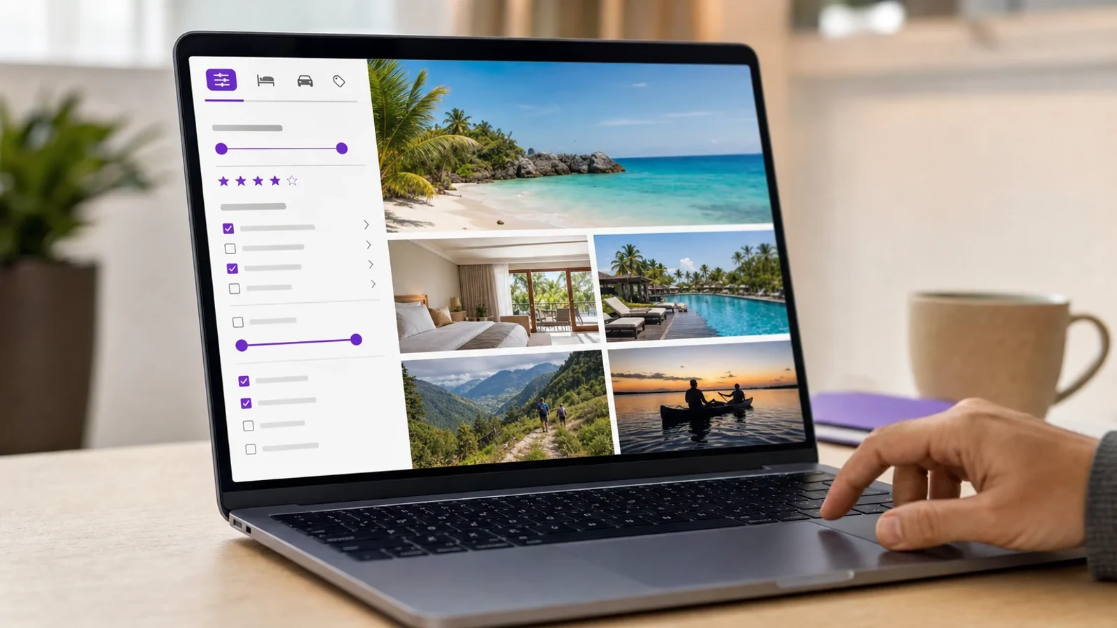
Granular filtering options are among the most powerful conversion tools on a travel website – and the most commonly missing. Baymard found 40% of accommodation and tour websites fail to provide essential Popular Industry-Specific Filters such as hotel amenities or tour duration. Offer at least 5 to 10 specific filter types.
The data backs this: in MeasuringU’s benchmark, “It is easy for me to filter on the website” was the top key driver of user experience scores, at 13% of variation. Filtering is the feature users reward most.
- Accommodation filters: amenities like pools and free parking, plus bedroom counts.
- Tour filters: duration, family-friendliness, meals included, activity level, departure time.
- Budget controls: price sliders that remove options outside a traveler’s budget.
- Stable sorting: price, rating, and relevance sorts that persist as filters change.
Academic work agrees: a Tourism Economics study on booking website performance found filters helping users find relevant results are central to moving a booking site from basic to sophisticated. When filters apply instantly, users stay oriented; when options vanish unexplained, they assume the system is broken.
Key takeaways
→ Place the booking search widget above the fold; 99% of tested users look for it immediately on arrival.
→ Offer at least 5 to 10 industry-specific filter types; 40% of accommodation and tour sites still do not.
→ Ease of filtering was the top driver of user experience scores in a 457-user benchmark study.
→ Keep sorting stable and filters persistent so users never lose context mid-comparison.
3. Transparent, All-Inclusive Pricing and Fee Breakdowns
Hidden fees are the fastest way to lose a committed buyer. Resort, cleaning, baggage, and service fees revealed late in the funnel drive cart abandonment, and usability testing by Userlytics found baggage-fee information frustrated most flight-booking participants. Travelers expect total price, taxes included, at the listing stage.
MeasuringU reinforces the business case: “I know how much I’ll be charged, including fees and taxes” was a significant driver of user experience scores and likelihood to recommend, at roughly 8% of variation each.
Implementation is straightforward: show accurate total-price estimates in search results, itemize taxes and fees before checkout, and explain any price change between search and payment while preserving selections. Silent updates undermine trust faster than almost anything in travel UX design.
Pro tip
If suppliers impose fees you can’t control, surface them as labeled line items on the listing page. A labeled “cleaning fee” at search stage converts far better than the same fee discovered at payment.
4. Interactive Maps and Location Awareness
Travel decisions are geographic. For Travel Accommodations, split-screen map and list views let users compare properties by proximity to beaches, transit, or city centers while keeping filters visible. For Travel Tours & Experiences, an embedded map showing the exact meeting point is essential for users unfamiliar with the area.
The gap is significant: Baymard found 57% of travel websites fail to provide an interactive map identifying meeting or departure points on tour pages, forcing customers to guess where a costly experience begins.
Beyond a static pin, show landmarks, transit access, walking distances, and radius-based search. This helps travelers judge whether a 7 a.m. departure is reachable from their accommodation and reduces pre-booking support inquiries.
5. Comprehensive Details for Accommodations and Tours
Users need enough information to book confidently without calling anyone. Baymard found up to 83% of tour operator websites fail to provide basic tour details upfront – transparent pricing, duration, or meeting points. One participant shopping for surf lessons opened each “Tour Details” page only to discard it upon discovering the cost.
The basic information travelers want before booking includes:
- Tour duration and start time for itinerary planning.
- Meeting points, ideally paired with the map above.
- Special requirements such as minimum ages or fitness needs.
- Full descriptions of the tour experience: what happens and what’s included.
- The cancellation policy, plainly stated, with refund and weather terms.
Accommodations demand parallel depth: photo galleries, bed configurations, and explicit house rules. Rich media reduces perceived risk; clear policies prevent disputes.
6. Authentic Social Proof and Third-Party Reviews
Curated testimonials no longer carry the weight they once did. Baymard found 85% of travel tour sites don’t link to third-party review platforms, and many users are skeptical of glowing, site-provided testimonials. Travelers want verifiable feedback from independent ecosystems like Google Reviews and TripAdvisor.
Integrate aggregate ratings from trusted platforms, link each rating to its source, and display recent traveler photos with scores. Distinguishing recent from outdated reviews builds trust, and negative reviews handled visibly often increase credibility.
This is also cheap to implement: claiming your Google Business Profile and embedding its review summary delivers verified social proof without building a review system.
7. Seamless, Mobile-First Checkout with Flexible Payments
Checkout is where previous UX investments are cashed in or wasted. Keep the reservation flow linear and distraction-free, with a progress indicator, selection summary, and visible conditions before payment. Rushed-feeling bookings increase abandonment even at competitive prices.
Support major cards plus Apple Pay and Google Pay, and consider Book Now Pay Later options for high-ticket itineraries. In MeasuringU’s benchmark, “The website keeps my information secure” was the second-strongest user experience driver at 9% of variation, so visible trust indicators directly affect perception.
Plan for failure states: explain payment failures and expired sessions without forcing a restart, then send instant email and SMS confirmations – delayed messages create uncertainty even when the reservation succeeded.
Key takeaways
→ 57% of travel sites lack a departure-point map and 85% lack third-party review links, so these are fast differentiation wins.
→ Up to 83% of tour sites omit basic details like price, duration, or meeting points on listing pages.
→ Perceived payment security drove 9% of user experience score variation in benchmark research.
→ Preserve user selections through payment errors and session expirations to prevent restart-driven abandonment.
How Entrepreneurs Can Implement These Core Features
You don’t need to rebuild your stack – just a prioritized audit and modular upgrades. Search placement, filters, and pricing transparency are typically achievable within weeks. Starting from scratch? Our guide to travel website development covers the foundations.
Upgrading your travel website UX
Audit search placement and mobile responsiveness
Open your homepage on a smartphone and confirm the booking widget is the first interactive element visible without scrolling. Test every search, filter, and calendar interaction on mobile, since a growing share of travel discovery and on-the-go bookings happens on small screens.
Add industry-specific filters
Inventory your catalog and define 5 to 10 filter attributes your customers actually use, such as amenities, tour duration, activity level, and cancellation terms. Most modern booking engines and content management systems support faceted filtering through plugins or native settings.
Surface total pricing early
Configure your listing templates to show all-in prices including taxes and mandatory fees, and add an itemized cost breakdown to the pre-checkout summary screen.
Embed maps and enrich detail pages
Add an interactive map to every tour details page showing the meeting point, and complete every listing with duration, restrictions, cancellation policy, and high-resolution media.
Connect reviews and automate post-booking workflows
Link your ratings to third-party review platforms, then set up automated confirmation emails, SMS reminders, and a customer account hub where travelers can retrieve vouchers and manage reservations.
Tip: When evaluating booking engines, prioritize those offering API integrations with inventory suppliers so rates and availability update automatically instead of requiring manual edits.
Modular booking engines and travel APIs let you adopt capabilities incrementally: a tour company can pair its site with a platform handling availability and payments, while an agency might integrate global distribution feeds for live rates. Our walkthrough on how to create a travel agency website explains these integrations, and our guide to a travel business website covers platform selection.
Warning
Avoid tiered add-on pricing that advertises a low base rate and reveals fees later; the reputational cost outlasts any short-term gain.
Frequently Asked Questions
What is the single most important feature on a travel website homepage?
The booking search widget. Baymard testing found 99% of users on OTA, hotel, and rental sites immediately look for it – make it the primary above-the-fold content.
How many filters should a travel website offer?
At least 5 to 10 industry-relevant filters. Baymard found 40% of accommodation and tour websites lack essential filters, and MeasuringU identified ease of filtering as the top user experience driver.
Why do hidden fees hurt travel website conversion?
Fees revealed late – resort, cleaning, baggage – are leading causes of cart abandonment. Knowing the total charge including fees and taxes significantly drove satisfaction and likelihood to recommend in the MeasuringU benchmark.
Are on-site testimonials enough, or do I need third-party reviews?
Both, with emphasis on third-party integration. Baymard found many users skeptical of curated testimonials and 85% of tour sites failing to link to independent platforms. Embed aggregate ratings from Google Reviews or TripAdvisor and link to sources.
What tour details do customers expect before booking?
Price, duration, start time, meeting point, special requirements, experience description, and cancellation policy. Baymard found up to 83% of tour operator sites omit these on listing pages.
How important is mobile optimization for travel websites?
Critical. Much travel discovery and on-the-go booking happens on smartphones, and J.D. Power’s satisfaction framework treats speed as a core factor. Fast load times, simple inputs, and mobile wallets are baseline.
Conclusion
The travel website features customers expect form a coherent pattern: reduce cognitive load, eliminate surprises, and reassure at every step. A dominant booking search, 5 to 10 industry-specific filters, early all-in pricing, interactive maps, comprehensive details, verifiable reviews, and mobile-first checkout address the failure points usability research documents. Audit quarterly, fix the highest-friction gaps first, and measure completion rates. Small operators who close these gaps compete effectively with larger brands, because trust and clarity – not budget – convert hesitant travelers into confirmed reservations.